
Technique · Guide
A useful neutral is not one fixed grey. It may lean warm or cool, remain pale enough for atmosphere, or become dark enough to anchor a shadow. Begin with two colours that pull against each other, change their balance in small steps and judge the samples dry. The goal is a neutral that belongs to the painting, not the removal of every trace of colour.
6 min read
The word mud often describes a mixture that has become duller or less controlled than intended. A subdued brown, grey or green is not a failure by itself. It becomes unhelpful when you cannot tell how it was made or how to move it warmer, cooler, lighter or darker.
At a glance
Start with two paints. Two colours make it easier to see which one is steering the mixture.
Change balance before adding another colour. A small increase in one paint may be enough to warm or cool the neutral.
Keep paint strength separate from hue. Add paint to deepen a mixture and clean water to make a paler version.
Judge the dry sample. A wet puddle can look darker than the colour left on the paper.
Use the labels as context, not a guarantee. Pigment codes help identify what is in each paint, but formulation and paper still affect the result.
What a neutral is doing in the painting
A neutral reduces the intensity of a colour without necessarily removing its identity. A grey may lean blue in a distant building, violet in a cloud or brown beneath foliage. Those differences help the mixture sit with the colours around it.
Begin by deciding what the passage needs. A background neutral may need to stay pale and quiet. A cast shadow may need a clear cool direction. A dark accent may need enough colour to connect it with the rest of the palette. Calling all three simply grey hides the decision you need to make.
This is why a ready mixed grey is not automatically wrong, and a mixed neutral is not automatically better. Mixing becomes useful when you want to steer the result from the colours already present in the painting.
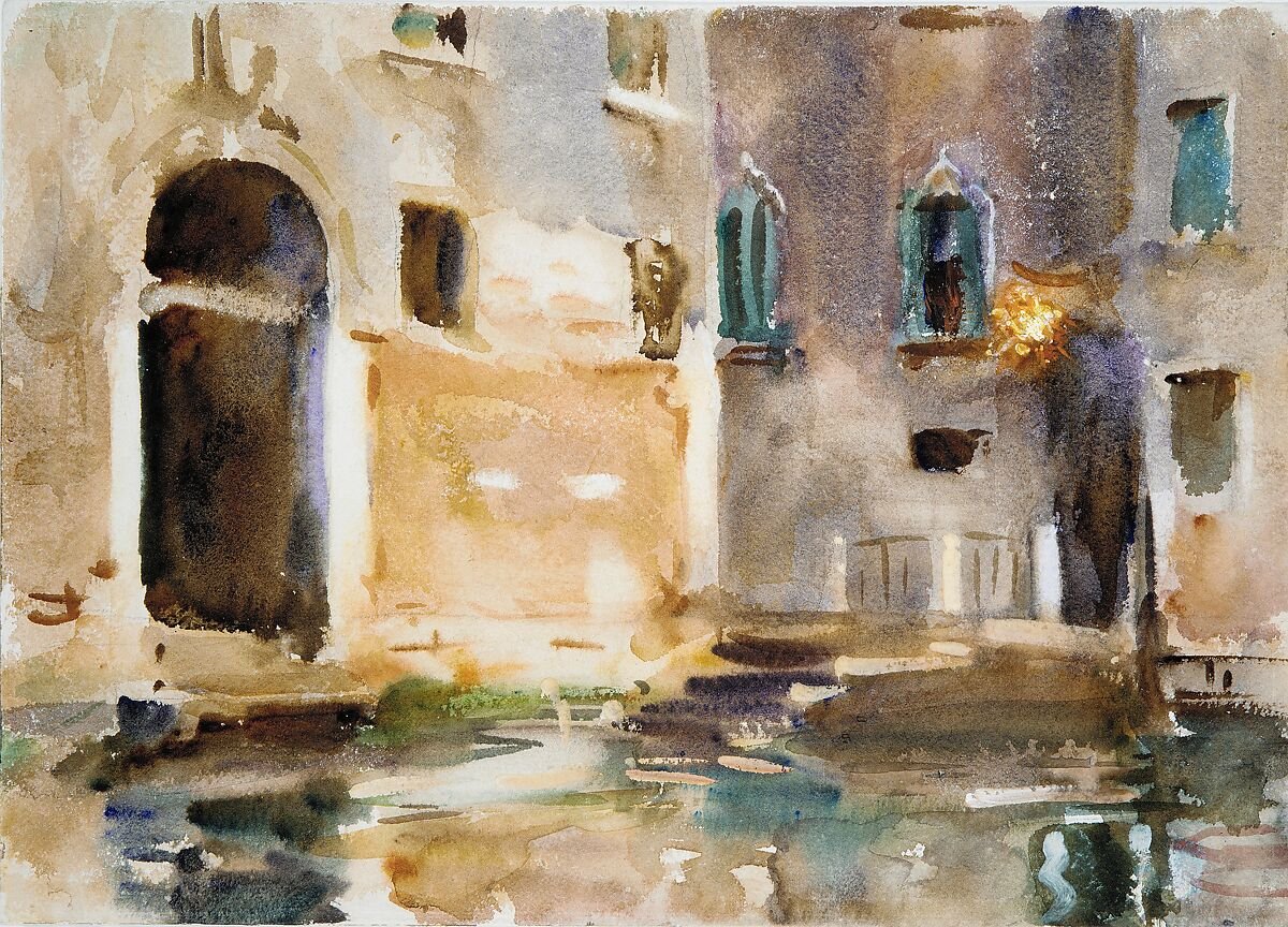
John Singer Sargent, Venice, c.1903. The subdued colours are not all the same grey: warm stone sits beside violet-grey shadow and blue-green reflections. A neutral can stay quiet while keeping a clear colour direction.
The Metropolitan Museum of Art, Gift of Mrs. Francis Ormond, 1950, 50.130.37. Museum record. Public domain.
Begin with two colours that pull against each other
Colours from different parts of the colour wheel can reduce one another’s intensity. A blue and an earth colour are a familiar place to begin, but the exact result depends on the two finished paints you own. Burnt Sienna, for example, is a colour name rather than one fixed formulation. Its pigment code and handling can vary between ranges.
French Ultramarine and Burnt Sienna are therefore best treated as a practical test pair, not a universal formula. Put a puddle of each paint on the palette and make three mixtures: one led by the blue, one near the middle and one led by the earth colour. A blue leaning mixture may suit a cool shadow. An earth leaning mixture may give a warmer brown. The middle may approach grey, violet grey or brown grey.
Other pairs can make equally useful neutrals. What matters is that you can identify the two paints, change their balance and repeat the comparison on the paper you use.
| If the mixture is | First adjustment | What to observe after drying |
|---|---|---|
| Too warm for the passage | Add a little more of the cooler colour | Whether it moves towards grey or becomes visibly cool |
| Too cool | Add a little more of the warmer colour | Whether warmth returns without losing the required depth |
| The right hue but too pale | Increase paint strength without changing the balance | Whether the stronger sample keeps the same direction |
| The right hue but too dark | Dilute a portion with clean water | Whether the pale version keeps its direction and still belongs with nearby colours |
| Duller than intended | Test a fresh puddle with the same two paints | Whether the first puddle picked up other paint, or the pair is simply quiet |
A neutral range from one pair
Rule a row of three separated squares and a second row of three, each about 3 cm across, on the paper you normally use. Prepare flowing, glossy puddles of your two paints.
- Mix three puddles from the pair: one led by the first colour, one balanced and one led by the second. Paint the first row.
- Take the balanced mixture and make it at three strengths: pale, middle and as concentrated as it will still flow. Paint the second row.
- Leave the sheet flat until it is matt and at room temperature.
- Label the paints, maker, pigment codes if shown, paper and date.
Look for the sample that fits your passage. Then look at whether the pale and concentrated versions keep the direction of the middle one. If none fits, repeat the range with a different pair rather than adding several colours to an uncertain puddle.
The colour mixing guide covers the first general two paint strip. This test applies the same habit to greys, browns and darks.
Pigment count is information, not a verdict
A single pigment paint is easier to interpret because you know which component entered the mixture. A paint made from several pigments can still be purposeful and useful. Its result is simply harder to predict from the colour name alone.
Do not assume that adding a third pigment automatically creates mud, or that two single pigment paints must make a beautiful neutral. Composition is one variable among paint strength, formulation, paper, water and handling. The guide to single-pigment watercolours explains that distinction, while pigment codes shows how to read the label.
If a mixture repeatedly surprises you, make the same comparison with the actual paints rather than replacing them on principle. The strip will tell you more about their partnership than a general rule can.
What people call mud: a subdued mixture or a disturbed wash
A colour may be quiet because of the pair you mixed. A passage may also look uneven because it was worked while the paper was damp. These are different questions.
When a wash has a low or breaking sheen, newly added water carries a high risk of a bloom and extra brushwork can disturb the surface. Let it dry before deciding whether the colour itself needs changing. The guide to watercolour blooms and backruns owns the full moisture sequence.
If the dry colour is useful but the passage is streaked, adjust the handling on the next attempt. If the dry colour itself is wrong, adjust the palette mixture. Separating those causes prevents a handling issue from becoming an unnecessary pigment rule.
Mixing a dark neutral
A dark neutral needs more paint as well as less water on the brush. Begin with a concentrated version of a tested pair and keep the mixture fluid enough to move. Make a small sample, let it dry, then decide whether it is dark enough and whether it leans in the direction the painting needs.
Tube black is another colour choice. Different black paints have different formulations and handling. Compare the black you own with a mixed dark at equal apparent strength. The useful question is which result gives the temperature, surface and relationship you want in that painting.
Transparency and handling belong to the finished paint and the maker’s rating, not to the colour name alone, so test the black you own.
Mix the neutral the painting needs
Begin with two identifiable paints and make a short range between them. Choose the sample that fits the passage, then alter one variable at a time: balance for warmer or cooler, paint strength for darker, and water for paler.
A neutral can remain visibly coloured. Control matters more than reaching a perfect grey, and a dry test on your own paper is more dependable than a universal recipe.