
Technique · Guide
Paint the tree, not every leaf. Start with the shape of the crown and its main areas of light and shadow, then choose the openings, branches and leaf marks that explain its character. Detail has a place, but it should support the larger shapes rather than replace them.
7 min read
“Simplify the foliage” is sensible advice until you have to decide what to leave out. Keep the things that make this tree different: a leaning trunk, a low spreading limb, a heavy side of the crown, or one opening that breaks its shape.
This guide concentrates on a leafy broadleaf tree seen from far enough away to fit the whole crown into the picture. A close botanical study, a bare winter tree and a forest interior need different treatment. Here, the aim is a tree with convincing structure before you add individual leaves.
At a glance
Keep the tree’s particular shape. Compare the width of the crown with its height and the amount of trunk showing beneath it.
Plan light and shadow before leaf marks. The pattern across the crown matters more than shading every small clump.
Reserve the important pale openings. A gap shows the background, which is not necessarily white paper.
Let branches appear and disappear. Draw what you can see, but check that the visible pieces belong to a plausible structure.
Finish selectively. A few marks can explain the foliage; more marks cannot compensate for an unclear value pattern.
Look for the tree before the leaves
In The Elements of Drawing, John Ruskin distinguishes studying a small spray of leaves from drawing an entire mass of foliage. His practical point remains useful: as distance increases, details that are clear close up cease to read separately.
Look at the tree at the size it will occupy on the sheet. Which features still register? Keep those as your starting information rather than enlarging every detail in a photograph. The guide to painting from a reference photo explains how to turn that information into a plan.
Give the silhouette its own character
The crown is the leafy upper part of the tree. Mark its highest point, widest points and lowest hanging growth lightly in pencil. Compare them with the position and lean of the trunk. This gives you proportions without drawing a continuous outline around every leaf.
Species can offer clues: Forestry England describes the mature English oak as having a broad, spreading crown. But a species description is not a template. Follow the actual tree, including its asymmetry and spaces between projecting limbs.
Avoid an evenly scalloped outline. Let some stretches be relatively simple and others broken by a projecting spray or deeper indentation. The outline should describe growth, not resemble decorative edging.
Group the light and shadow
Squint at the subject and identify the largest light and dark areas. You are not counting leaves or giving every clump its own shading. You are deciding how light travels across the whole crown.
A small plan with light, middle and dark groups is useful. It need not divide the tree into equal amounts of each. Under flat light, the differences may be restrained; against a bright sky, much of the crown may form one dark shape. Follow the subject rather than forcing a sunny pattern onto it.
Look for shadows that connect across neighbouring groups of leaves. Connected areas can hold the crown together; a separate dark crescent under every clump can make it look like a pile of balls. Keep a few important separations and allow less important ones to merge. The guide to working light to dark covers the painting sequence behind this plan.
Decide what the gaps show
An opening in the foliage is a piece of background seen through the tree. It may show sky, a wall, another tree or a branch. Its colour and value depend on that background, not on a rule that every hole must be white.
Choose the openings that explain the tree’s structure. A distinctive gap beside the trunk can matter more than several tiny pinholes. Compare their shapes and positions with the reference before painting, rather than scattering holes wherever the crown feels empty.
For pale sky behind darker foliage, one option is to establish the sky wash first and let it dry. Paint the foliage around the selected openings, preserving that sky colour. Where the sky needs bare paper, leave the paper untouched. The guide to keeping whites explains the available approaches.
Painting darker surroundings around a lighter form is negative painting. It does not mean that a light gap can simply be painted over a dark tree with transparent colour. Opaque paint can add a pale opening later, but it makes a covering layer rather than revealing the original paper.
Build the foliage in a workable order
With the pale openings planned, lay the lightest useful foliage colour across the areas that need it. This is not a compulsory pale wash over the whole tree. Leave out the sky gaps and any trunk or branch shapes that must remain lighter than their surroundings.
Where you want neighbouring colours to mingle, work while the receiving paint remains wet, with an even glossy sheen. Once that sheen begins to break, stop adding wet paint to chase the effect. Let the area dry before making another decision.
Next, paint the connected shadow shapes over the fully dry first layer. Leave enough of the earlier colour to describe the light. Use the value plan to choose where shadows spread and where they stop, rather than outlining every foliage group with darker paint.
You do not need a fixed number of layers. If one wash already gives an area the value it needs, keep it. Save later dark accents for the few overlaps or recesses that genuinely need more separation.
Show enough trunk and branch
Tree structure is not a ladder of sticks behind a green cloud. Look for the main division of the trunk, changes of direction and the points where foliage conceals the wood. Check that a branch disappearing behind one mass could plausibly reappear on the other side.
The trunk is not automatically the darkest part. A pale section of bark against dark foliage may need reserving; a dark branch against a light wash can be added afterwards. Plan from those relationships rather than deciding that all wood comes last.
Naturalist and artist John Muir Laws’s oak demonstration makes a useful distinction between observed branching and the simplified branch patterns we carry in our heads. Return to the reference when the structure begins to look too regular. Near the base, compare trunk and ground together so the tree has a clear point of contact rather than ending abruptly above it.
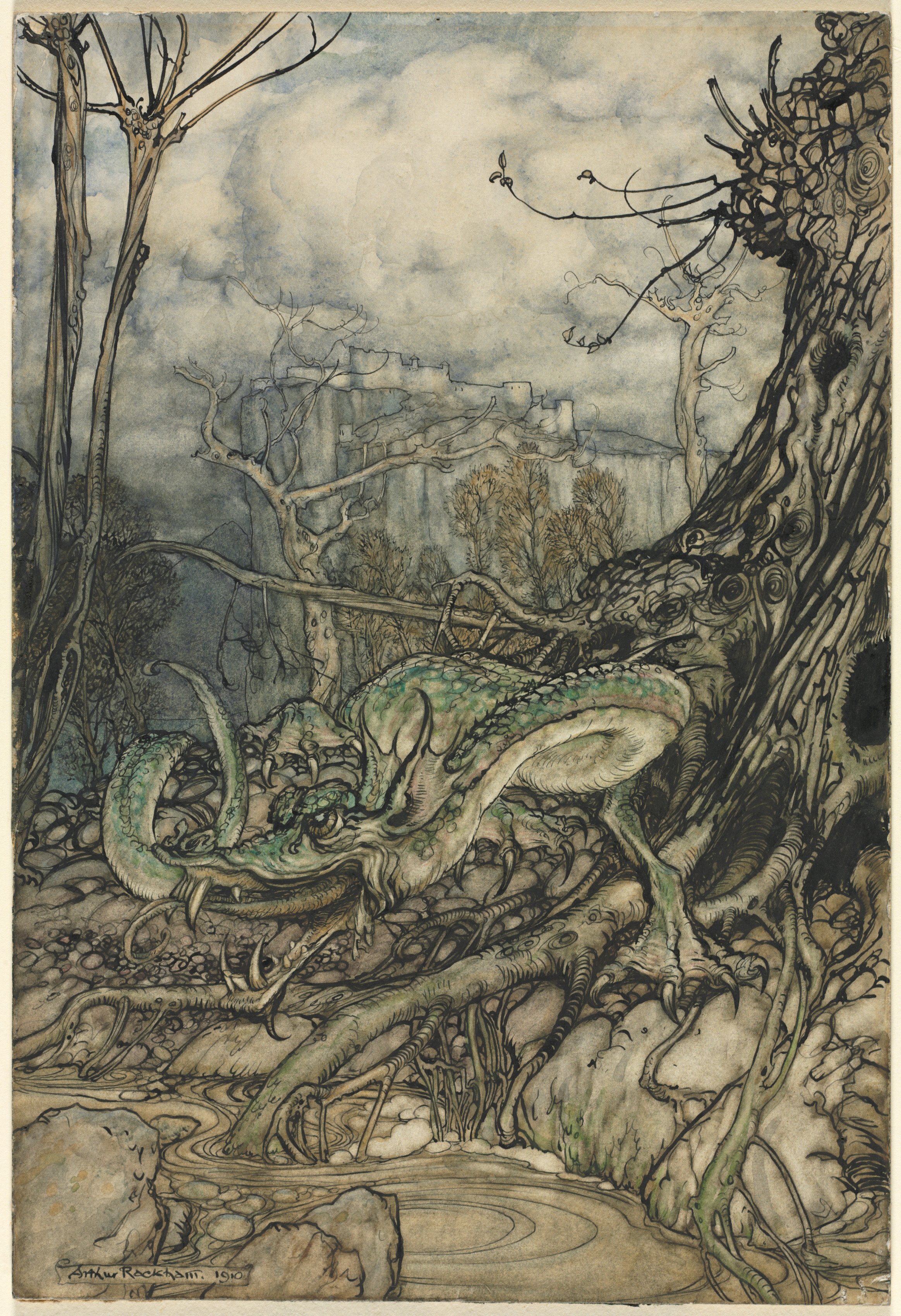
Arthur Rackham, The Green Dragon, 1910. Twisting trunks and roots give these trees their character before foliage enters the picture. Their direction, taper and branching carry the structure; the restrained colour leaves the drawing clearly visible.
Pen and black ink and watercolour on paper. Cleveland Museum of Art, Gift of Mrs. Don Hunter, 1954.652. Collection record. Public domain / CC0.
Vary edges without losing the form
A soft edge is a gradual transition. A quiet edge remains visible but attracts little attention. A genuinely lost edge no longer reads as a boundary. Similar values can help shapes merge, but colour and texture may still separate them.
Give a few parts of the outer crown enough definition to explain its shape. Inside, let less important divisions stay quieter. You do not have to soften the entire outside edge to make a tree look natural, or sharpen every internal group to show volume.
If a transition needs softening during painting, the receiving area must still be wet. On a drying wash, leave it alone and reassess once dry. The guides to hard and soft edges and lost and found edges separate the handling from the visual decision.
Choose greens without losing the values
One green can describe form if its light and dark values are organised. Several different greens can still look flat when they all carry the same tonal weight. Before changing a mixture, ask whether the problem is its colour or its value.
Choose colour changes from the subject and your painting’s intention. Do not assume every shadow needs blue or every light needs yellow. Keep enough separation between the planned light and shadow groups that the crown remains legible when viewed small.
Use the paints already on your palette and judge a dry sample on the paper you are using. The guide to colour mixing for beginners explains how to separate changes in paint proportion from changes in dilution.
Let a few marks suggest the leaves
Add detail where it carries information: a spray against the sky, an overlap near the area of interest, or a nearer part of the crown where individual leaves are visible. Leave some painted areas without additional texture.
Drybrush over a fully dry wash can add broken marks without filling the entire area. It suggests texture rather than guaranteeing leaf shapes. Compare the size of the marks with the scale of the tree; an oversized dab can suddenly look like a separate branch or clump.
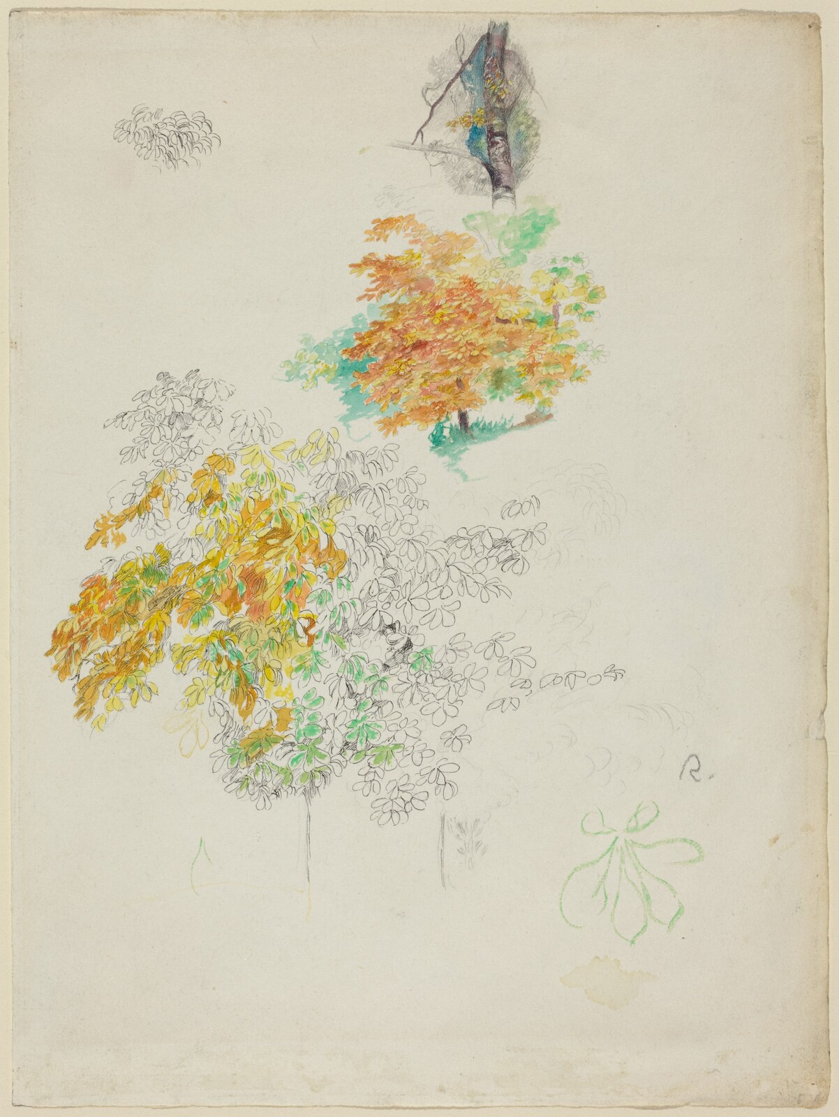
Auguste Renoir, Studies of Trees, 1886. Individual leaf outlines sit alongside broader areas of colour: detail and grouping can coexist. This is an independent historical study, not a demonstration of the sequence above.
Pen and black ink, watercolour and graphite on J. Whatman wove paper. Gift of Dr. and Mrs. George Baer, in Honor of the 50th Anniversary of the National Gallery of Art. Courtesy National Gallery of Art, Washington. Collection record, accession 1990.94.1. Public-domain image, CC0.
Common problems
| What you see | What to check | A useful next decision |
|---|---|---|
| A spotty crown | Texture has replaced the main shapes | On the next pass or study, group the shadows before adding detail |
| A pile of rounded clumps | Each group has equal, separate shading | Join selected shadows and reduce repeated divisions |
| Pale holes look pasted on | They do not match the background | Plan their colour with the background, before the foliage |
| Branches look disconnected | Visible pieces do not align through the leaves | Recheck the main structure in a pencil plan |
| The crown is indistinct | Important shapes have too little separation | Once dry, strengthen only the boundary that explains the form |
| More greens have not helped | Colour changed but values stayed similar | Return to the light and shadow plan |
These are planning responses, not promises of an easy repair. If the paper has been heavily worked, a fresh study may be more useful than another correcting layer.
Make the structure convincing before the detail
Keep the tree’s distinctive outline, the main light and shadow pattern, a few meaningful openings and enough visible wood to explain its growth. Those are the decisions worth protecting.
Then ask what the next mark would add. If it clarifies a branch, a leaf group or the area of interest, it may earn its place. If it only repeats texture already there, leave it out. Paint the tree first; let the leaves serve it.