
Artists · Long read
Turner’s watercolours seem to dissolve the world. Look longer, and the decisions holding it together begin to appear.
14 min read
The mountains are easier to lose than the people. In JMW Turner’s The Lake of Zug, a distant peak almost disappears into the luminous sky, while a few small figures beside the water remain surprisingly distinct. There are touches of red, bent bodies, a boat close to shore. The landscape opens around them, blue on one side and golden on the other.
At first the painting seems to offer an atmosphere rather than a place. Then the town emerges. A tower interrupts the mountain’s blue. Reflections gather beneath the buildings. The lake, which looked like a spread of colour, becomes a surface across which someone might travel.
This movement between recognition and uncertainty is one of the pleasures of Turner’s watercolours. We are given enough to enter the scene, but not enough to exhaust it at a glance. The picture asks us to look again.
It also poses a useful question for anyone who paints with water. How can a painting allow so much to dissolve without losing its structure? The answer is more interesting than looseness, speed or a particularly successful wash. Across Turner’s work, drawing, contrast, human activity and the physical handling of paint give light something to act upon.
Before looking closely
Atmosphere still needs an arrangement. Look for the dark masses, small firm accents and changes of scale that keep a luminous scene legible.
Watercolour does not always mean transparent paint alone. Turner also used bodycolour and removed paint. A bright mark is not automatically untouched paper.
A finished image is not a record of every brushstroke. We can examine its relationships without pretending to reconstruct an undocumented painting sequence.
The light has somewhere to go
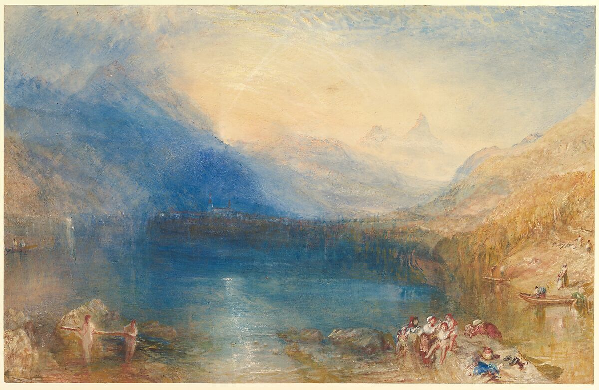
JMW Turner, The Lake of Zug, 1843. A dark blue mountain, a golden shore and a few distinct figures give the luminous distance its scale.
Watercolour and bodycolour (gouache) with reductive techniques over graphite. The Metropolitan Museum of Art, Marquand Fund, 1959, 59.120. Museum record. Public domain.
Start with the large shapes. The mountain on the left slopes towards the town. The hillside on the right comes down towards the water, leaving an opening between them. Above that opening, the sky is pale and warm. Below it, a narrow broken brightness runs towards the foreground.
The painting is not uniformly misty. There is considerable weight in the left-hand blue, and the foreground has stones, clothing and patches of earth. Those comparatively solid areas make the pale centre feel more distant. If everything were equally light and indistinct, the distance would have less to withdraw from.
Now look at the town. It is a thin band compared with the mountains, but it matters enormously. The little verticals establish buildings, and buildings establish a human scale. The mountains become large partly because the town is small. The pale shapes above it can remain elusive because something below them has already told us where we are.
The figures do another kind of work. Their red and pale clothing provides small interruptions among the blues and earth colours. They bring the eye back from the distant light to the near shore. Instead of travelling into the centre and stopping there, we move between a remote prospect and a place occupied by people.
The Met identifies the setting as the view towards Arth, between the Rossberg and Mythen mountains, and places the work among the large Swiss watercolours developed from preparatory designs after Turner’s travels. This is a composed watercolour, not simply a coloured note caught at the lakeside. The Lake of Zug.
Its immediacy is nevertheless convincing. The small activities seem to continue while the light changes. That is a distinction worth keeping: an image can feel momentary even when making it required prolonged consideration.
The draughtsman inside the weather
Joseph Mallord William Turner was born in London in 1775 and entered the Royal Academy Schools at fourteen. His early experience included architectural draughtsmanship and copying other artists’ work. Observation and drawing remained important throughout a career that produced hundreds of travel sketchbooks. Those are useful facts to remember before treating his later atmosphere as a departure from knowing how things fit together. The Met’s account of Turner’s career.
An early watercolour offers an unexpected way into that discipline. Dark Prison (Carcere Oscura), dated 1790–99, is a copy after an etching by Giovanni Battista Piranesi. Its subject is an imaginary interior, not a place Turner visited. Museum record.
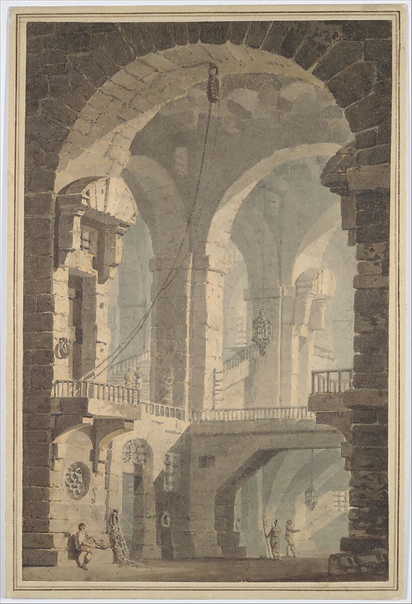
JMW Turner, after Giovanni Battista Piranesi, Dark Prison (Carcere Oscura), 1790–99. Successive arches lead into the interior; the small figures make its masonry feel immense.
Watercolour over graphite. The Metropolitan Museum of Art, Rogers Fund, 1906, 06.1051.3. Museum record. Public domain.
The nearest arch makes a dark frame around the scene. Beyond it are lighter arches, stairways and bridges. The eye moves through them because their overlaps and changes of tone describe successive spaces. The architecture is intricate, yet the broad division between dark foreground and paler interior is immediately readable.
There is something almost theatrical about the arrangement. We look through an opening into another world. The little figures near the bottom give us a measure of the height above them, while the repeated arches suggest that the building extends beyond what we can see.
This is not a claim that a prison drawing contains a ready-made formula for a Swiss lake. Nor should Turner’s choices here be separated from the Piranesi design he was copying. It does, however, make the later painter harder to reduce to a gifted handler of flowing colour. Space, scale and the organisation of light were problems he had worked on long before his most luminous landscapes.
The difference between the two pictures is striking. In the prison, an architectural boundary often announces itself clearly. At Zug, a mountain can become difficult to separate from the sky. But both pictures give us places to stand, things to look past and distances to enter.
For a painter, this is a more useful relationship than the familiar opposition between drawing and freedom. Drawing can provide the knowledge that allows a boundary to be left incomplete. It need not remain equally visible everywhere. Our guide to sketching before watercolour considers that practical choice without making a detailed preliminary drawing compulsory.
London is not just a view
Turner’s atmosphere also belonged to a world of work, travel and change. It was not confined to mountains and sunsets. In View of London from Greenwich, made in 1825, the city stretches beneath an enormous sky, but the foreground is busy with people and objects that refuse to behave as anonymous landscape decoration.
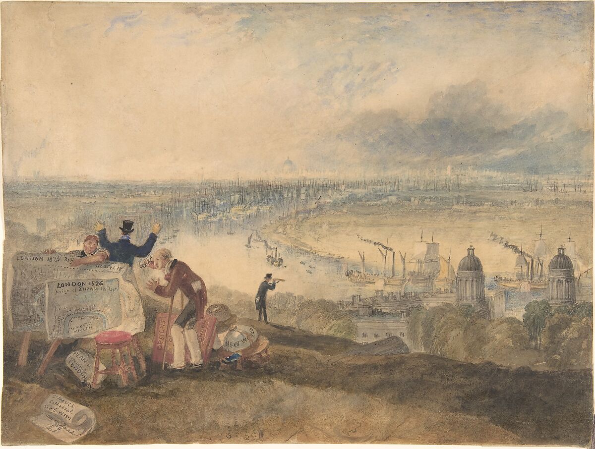
JMW Turner, View of London from Greenwich, 1825. Maps and figures occupy the foreground while the river carries the eye towards a much paler city.
Watercolour and ink and traces of graphite. The Metropolitan Museum of Art, Bequest of Alexandrine Sinsheimer, 1958, 59.23.23. Museum record. Public domain.
At the left, maps are displayed beside a seated woman and an older man. A figure behind them raises both arms. Farther along the slope, another person looks through a telescope. The river curves away between buildings and shipping, gathering the scattered activity into a route through the picture.
The Met reads the naval pensioner, fashionable man and observer with a telescope as references to past, present and future. It also identifies steam boats moving among the sailing ships. The sheet belonged to a proposed series of London views intended for prints, although that project was not realised. View of London from Greenwich.
Look at how differently the near and far information is handled. The maps insist on their physical presence: they have edges, lettering and surfaces turned towards us. Beyond them, the city becomes a delicate accumulation of vertical marks. The distant buildings are less individually assertive, yet the sense of an extensive place survives.
That contrast makes the scene interesting to read as well as to look at. In the foreground, the city can be measured, described and held in the hands as a plan. Beyond it lies the city itself, too large and active to take in with the same certainty. The telescope offers another way of looking, directed towards the traffic on the river. This is a visual reading of the arrangement, not a claim that Turner left us an explanation of every object.
The atmosphere does not remove London from history. It allows a mass of buildings, vessels and human purposes to occupy one continuous space. Even the broad sky feels different when there is so much organised activity beneath it.
There is an important corrective here to the idea of Turner as someone interested only in colour. Colour can carry the scene, but the scene still contains questions about who is looking, what they can see and how the world around them is changing.
A sketch, a possibility, a finished picture
A rapid-looking sheet and a completed watercolour should not automatically be read as the same kind of object. A sketch might record a place. A colour study might explore an arrangement. A finished picture might develop those observations for a collector or for reproduction.
The exhibition Turner. Light is colour, organised at the Museu Nacional d’Art de Catalunya with Tate works, followed this movement from drawings and exploratory colour beginnings to completed paintings and prints. Its account describes outdoor studies as material Turner could return to and transform in the studio. Exhibition research.
The distinction changes how we look. An incomplete area in a study need not be a deliberate final statement about emptiness. Equally, a finished watercolour need not describe everything that a study recorded. The purpose of the sheet matters as much as its apparent level of detail.
It also changes the story of spontaneity. What looks like a sudden solution may rest on earlier looking, another drawing or a decision made away from the final sheet. We do not need to deny the pleasure of an unrepeatable mark to acknowledge the work surrounding it.
Turner’s watercolours reached audiences through more than the original sheets. His designs were also translated into engraved print series, including coastal views. In that setting, a composition had to carry across a change of medium and into another person’s handling of the image. The Wallace Collection’s account of Turner.
For readers accustomed to meeting paintings as luminous images on a screen, that is worth pausing over. The picture has a history of being made, reproduced and encountered. The version before us is not the only form in which someone might have known it.
Watercolour without the purity rule
The apparent ease of The Lake of Zug conceals a materially varied surface. The Met catalogues watercolour and bodycolour, with reductive techniques over graphite. Its account describes paint being applied in different consistencies and scraped away to recover light. Transparent washes were part of the picture, not the whole account of its making. Technical description.
Bodycolour is opaque watercolour, often called gouache. Its presence matters because it prevents us from turning the painting into evidence for a rule it does not obey: that luminosity must come exclusively from paper left untouched beneath transparent colour. For the wider distinction, see transparent and opaque watercolour.
There is no need to pretend that adding paint and removing it are interchangeable. They can produce different surfaces and different kinds of light. The point is that a convincing luminous effect does not disclose its entire material history simply by looking luminous.
Nor does the picture give permission to scrape any modern sheet until it glows. Historical evidence about a particular work is not a guarantee about another paper, pigment or treatment. It is more useful here as a challenge to how we judge a painting. A surface can have been worked and reworked without its final effect becoming heavy.
Conservation scientist Joyce Townsend describes Turner’s use of such varied means as rubbing, scratching and applying fine details, while warning that the sequence behind a complex late watercolour may not be recoverable: different routes could lead to the result we see. Turner’s materials and techniques.
That uncertainty is valuable. It leaves us free to look closely without inventing a demonstration. We can say where an edge is firm, where a colour becomes pale and where a light interrupts a dark area. Unless documentation supports it, we should be slower to say exactly which tool made the mark or how wet the sheet was at that moment.
The details that earn their place
Return to the shore at Zug. A figure can be small in area and large in consequence. It gives the eye a recognisable body, a scale and a suggestion of activity. A tower can perform a similar service for a town. Neither needs to compete with the whole mountain.
This is different from adding detail evenly across a painting. If every slope, building and reflection carried the same density of information, there would be less difference between arriving at the near shore and looking into the distance. Here, the distribution of detail helps create that journey.
Notice, too, that the distant town is not simply blurred into non-existence. It retains little interruptions and accents. Distance is allowed some specificity; the foreground is allowed some uncertainty. The picture feels richer than a rigid division between a sharp front and a soft back.
The edges contribute to that variety. Parts of a mountain remain clear enough to follow; elsewhere its boundary becomes difficult to locate. The result is not merely a soft outline. At some points, neighbouring areas approach each other so closely that the boundary ceases to be distinct. The guide to lost and found edges explores that difference.
What matters in this painting is the distribution. A disappearing boundary has more effect when another boundary remains. A small precise accent matters because the surrounding area asks less insistently for attention. Restraint here does not mean using little paint or making few marks. It means allowing different parts of the picture to do different amounts of descriptive work.
The Turner we inherit
It is tempting to arrange Turner’s career as a simple escape from detail: first drawing, then freedom, finally something close to abstraction. That story makes the later pictures easy to admire, but it can make the earlier ones too easy to dismiss.
The three sheets here suggest a less tidy relationship. The prison uses a restricted colour range to construct a formidable space. Greenwich combines a broad atmospheric view with unusually insistent foreground information. Zug permits a mountain to fade while keeping people and buildings in play. Each has a different balance of description and suggestion.
The later work does not need to be praised as a rehearsal for a future art movement. It already offers something demanding on its own terms: an experience of a particular landscape in which visibility is unequal and recognition takes time.
There is another complication. We do not necessarily see every colour as Turner left it. Townsend notes that light-sensitive colours in some of his Yorkshire watercolours may have changed their appearance, including the balance of skies and greens. That is a specific conservation caution, not a licence to diagnose fading in every pale Turner reproduction. Conservation discussion.
It should nevertheless make us cautious about turning the colour of a digital reproduction into a precise historical recipe. The image is excellent for studying broad relationships. It is a less secure basis for announcing an original pigment mixture, or deciding that every subdued area was intended to be subdued in exactly that way.
What remains after the glow
The most useful thing to take from Turner is not a promise that more water will make a painting freer. It is the possibility of choosing where description is necessary and where it can give way.
At Zug, the light is held between substantial landforms. The town supplies scale. The figures bring us to the shore. Enough remains definite for the rest to become uncertain. Take away those relationships and a similar spread of beautiful colour might offer much less to look at.
That is why the picture rewards a second visit. After the first attraction of the glow, there are still decisions to discover: an interruption in a contour, a patch of clothing, a reflection that becomes visible only when the eye settles. The atmosphere does not use up the painting. It gives us a reason to stay with it.