
Technique · Guide
Autumn watercolour painting begins with relationships: a yellow crown against grey sky, rust-coloured leaves beside wet green grass, a dark branch showing through a thinning canopy. Choose the contrast that makes the scene worth painting, then organise the colour and detail around it.
7 min read
A handful of leaves caught at the edge of a path can say as much about autumn as an entire hillside of orange trees. The season gives you changing colour, but also gaps, exposed structure and small accumulations. What has fallen can matter as much as what remains overhead.
This guide looks at autumn landscapes, woodland edges and small seasonal subjects. The aim is to recognise what has changed, choose a useful palette and keep the painting from becoming an even covering of warm colour. A particular tree or stretch of ground is a stronger starting point than an idea of what autumn ought to look like.
At a glance
Keep some of the green you see. Changing leaves, evergreen foliage and grass can sit beside reds, yellows and browns.
Choose the light before the mixtures. A backlit leaf, an overcast canopy and a wet bank ask for different value relationships.
Give the strongest colour a place. Quieter surrounding areas help a small warm accent register.
Notice the new openings. Gaps in foliage and visible branches can identify the season without extra orange paint.
Group fallen leaves before describing them. Paint the drift or band, then select a few individual shapes.
Find the part of autumn that interests you
Before drawing, name one thing you want the painting to keep. It might be a pale birch against a dark hedge, a red tree reflected in a pond, or a lane partly covered by leaves. That choice helps you decide which colours deserve emphasis and which details can be reduced.
Look for something more specific than a collection of autumn colours. Is the crown still full or almost bare? Are the leaves bright and flat, curled and brown, or pressed together on wet ground? A painting of early change will look different from one of the last leaves on exposed branches.
The change is not uniform. Kew explains that individual leaves can be at different stages, giving one tree a range of changing hues. You can retain that variation without painting each leaf: allow patches of green, yellow and russet to belong to the same crown.
Choose a manageable part of the view. The existing guide to trees and foliage covers the crown, trunk and main shadow masses. Here, the extra decision is which seasonal changes need to remain visible.
Build an autumn watercolour palette around the scene
Start with the colours already in your palette and identify the jobs they need to do. Many autumn subjects need a yellow, a red, a blue and a useful earth colour, but the scene may call for fewer. A muted hedge might depend more on greens and browns than on a bright orange.
A yellow and red can provide an orange starting point. A little blue may help quieten it towards a brown or neutral, depending on the paints. Try the actual combination on spare paper before committing it to the picture. Pigment choice and proportion affect the result, so a colour name alone is not a reliable mixing recipe.
Keep a brighter mixture separate from the subdued mixtures. If every adjustment happens in the same puddle, it becomes difficult to recover the clear yellow or red you meant to reserve for an accent. The guide to colour mixing for beginners explains how to compare the paints you own.
| Colour role | What to look for in the subject | What to prepare |
|---|---|---|
| Warm accent | A yellow crown, red leaves or a bright patch of bracken | A clear mixture kept separate from the quieter colours |
| Remaining green | Grass, ivy or leaves that have not changed | A green matched to that area, rather than removed to fit the season |
| Quiet surroundings | Grey sky, distant vegetation or dull ground | A restrained mixture that supports the warm area |
| Structural dark | A trunk, opening or connected shadow | A dark related to the colours already in the picture |
Muted colours are useful parts of this palette. A grey-green beside a red leaf, or a violet-grey beneath yellow foliage, may do more for the painting than another bright patch. The guide to mixing neutrals covers adjusting these quieter mixtures without losing control of their character.
Keep the landscape around the colour
Autumn colour becomes convincing when it belongs to a place. Leave room for grass, earth, sky, water and built structures. These areas give the foliage its setting and prevent every part of the picture from making the same statement.
In Boyce’s landscape below, the small orange tree is surrounded by green slopes, subdued vegetation and an extensive pale sky. The industrial structures remain visible on the horizon. The season is part of an inhabited landscape, rather than a colour effect spread across the whole sheet.
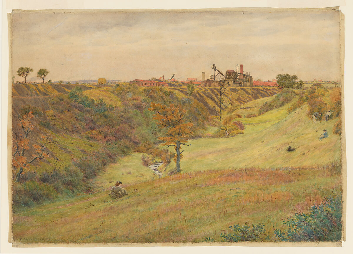
George Price Boyce, Autumn landscape with a colliery, 1866–67. Greens remain prominent beside russet vegetation and the small orange tree. Broad bands of ground and the pale sky give the warmer marks room without requiring every area to turn gold.
Watercolour, gouache and gum. The Metropolitan Museum of Art, Purchase, Friends of Drawings and Prints Gifts, 2023, 2023.266. Collection record. Public domain / CC0.
Read the light before making the foliage brighter
Light passing through leaves. Look for the patches that appear luminous and compare them with the darker leaves, branches or background nearby. Preserve their lightness early. Repeatedly adding stronger orange can darken an area that needed to stay light.
An overcast scene. Look for subtler colour differences and broad value groups. You may find the interest in a green-to-russet transition rather than a dramatic cast shadow. Keep any dark openings that are actually present, but do not invent strong sunlight to make the subject seem more autumnal.
Wet foliage or ground. Separate the darker local colour from reflections of sky or nearby objects. A wet leaf can contain a pale reflected highlight as well as a darker body colour. Adding water to the painted area will not, by itself, explain that distinction.
There is no single autumn sky colour. A clear blue sky and a low grey one change the balance of the same tree. Choose the relationship from your observation; the guide to skies and clouds develops the sky itself.
Paint the openings as the canopy thins
As leaves fall, sky appears between branches and the internal structure becomes easier to see. Those openings can be as important as the remaining colour. Plan their shapes before filling the crown, especially where a pale gap needs to stay distinct.
Keep the gaps irregular and related to the branches around them. Repeated small dots of pale paper can look like decoration. One larger opening near a fork, with smaller breaks elsewhere, may say more about the tree’s structure.
Show branches where you can see them, then let foliage interrupt them. A dark line drawn continuously over every patch of colour can flatten the crown into a diagram. When a light opening is defined by the darker area beside it, the guide to negative painting explains the surrounding-shape approach.
Treat fallen leaves as part of the ground
First look at how the leaves collect. They may form a band beside a kerb, a drift beneath a hedge or a broad covering broken by bare patches. Paint that larger arrangement before choosing individual leaves.
A few recognisable shapes can establish what the rest of the marks represent. Keep their scale consistent with their position in the scene. Farther away, a change in colour or texture may be enough; a clearly outlined leaf can become unexpectedly large and distracting.
In a close study, different information matters. A curled edge, a folded surface or a small cast shadow can explain a single fallen leaf more clearly than a full network of veins. Choose whether you are painting an individual object or a covering on the ground, rather than using the same amount of detail for both.
Give the strongest colour somewhere to belong
Choose where you want the eye to settle and compare the other warm areas with it. Several equally bright patches may compete. You can reduce their size, quieten their colour or connect them into a supporting group rather than remove them entirely.
Colour emphasis also depends on the background. La Farge’s decorative autumn below places red and orange leaves against blue-green space. The contrast is part of the design; it need not be copied as a fixed formula for a landscape. A restrained scene can find its emphasis in one yellow leaf against dark earth.
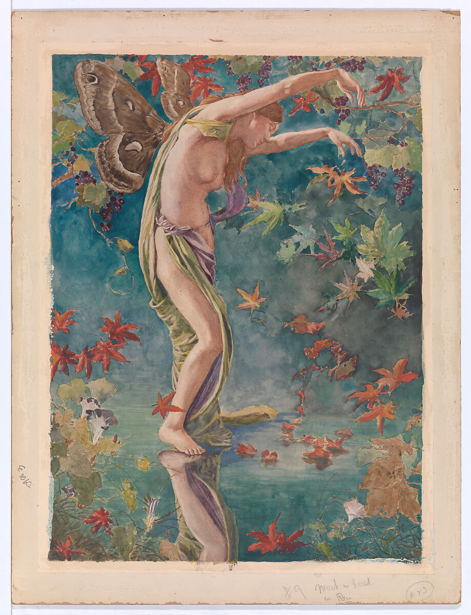
John La Farge, Autumn Scattering Leaves, about 1900. Red and orange leaf shapes stand apart from the blue-green background, while green foliage remains in the design. Created as a proposal for a stained-glass window, this is an imagined autumn whose colour relationships are deliberately arranged.
Watercolour and gouache on paper. The Metropolitan Museum of Art, Gift of Jacqueline Loewe Fowler, 2020, 2021.14.20. Collection record. Public domain / CC0.
Choose an autumn subject you can organise
A short stretch of path is a useful subject when the leaf covering matters most. Keep the path’s direction clear and let its edges gather the warmer marks. You do not need a complete woodland to establish the setting.
A single tree against a hedge gives you a direct comparison between changing foliage and a quieter background. Keep its particular crown and the most revealing openings. A pond margin adds another possibility: the same warm colour can appear in the tree, in its reflection and among leaves at the water’s edge, with a different treatment in each place. The guide to water and reflections explains those distinctions.
For a smaller subject, choose a fallen leaf with an interesting turn or fold. Preserve that shape and its main colour changes before adding veins. These are starting points for observation, not a requirement to paint every familiar symbol of the season.
Stop before texture replaces the season
When an autumn painting feels unconvincing, check the large relationships before adding more leaf marks. Has green disappeared even though it matters in the subject? Is the lightest foliage too dark? Have the canopy openings closed? Does the ground still have a direction beneath its texture?
Make any response specific to that problem. Additional orange will not restore a lost opening or correct the scale of a foreground leaf. If a wash is drying, allow it to dry before deciding on further work. The guide to loose watercolour painting helps distinguish a useful detail from another mark added because the sheet feels unfinished.
Paint the change you noticed
Choose the feature that made you stop: a bright crown, a newly visible branch, leaves gathered beside a path. Keep the surrounding greens, greys and open spaces that make that feature particular. Organise the light and dark areas before asking small marks to explain the season.
Autumn can be vivid, subdued, full or almost bare. A painting becomes more interesting when it commits to the autumn in front of you.